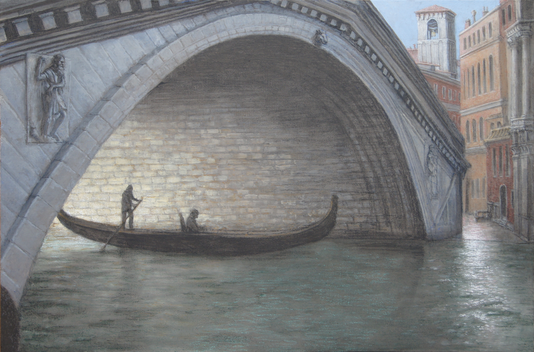
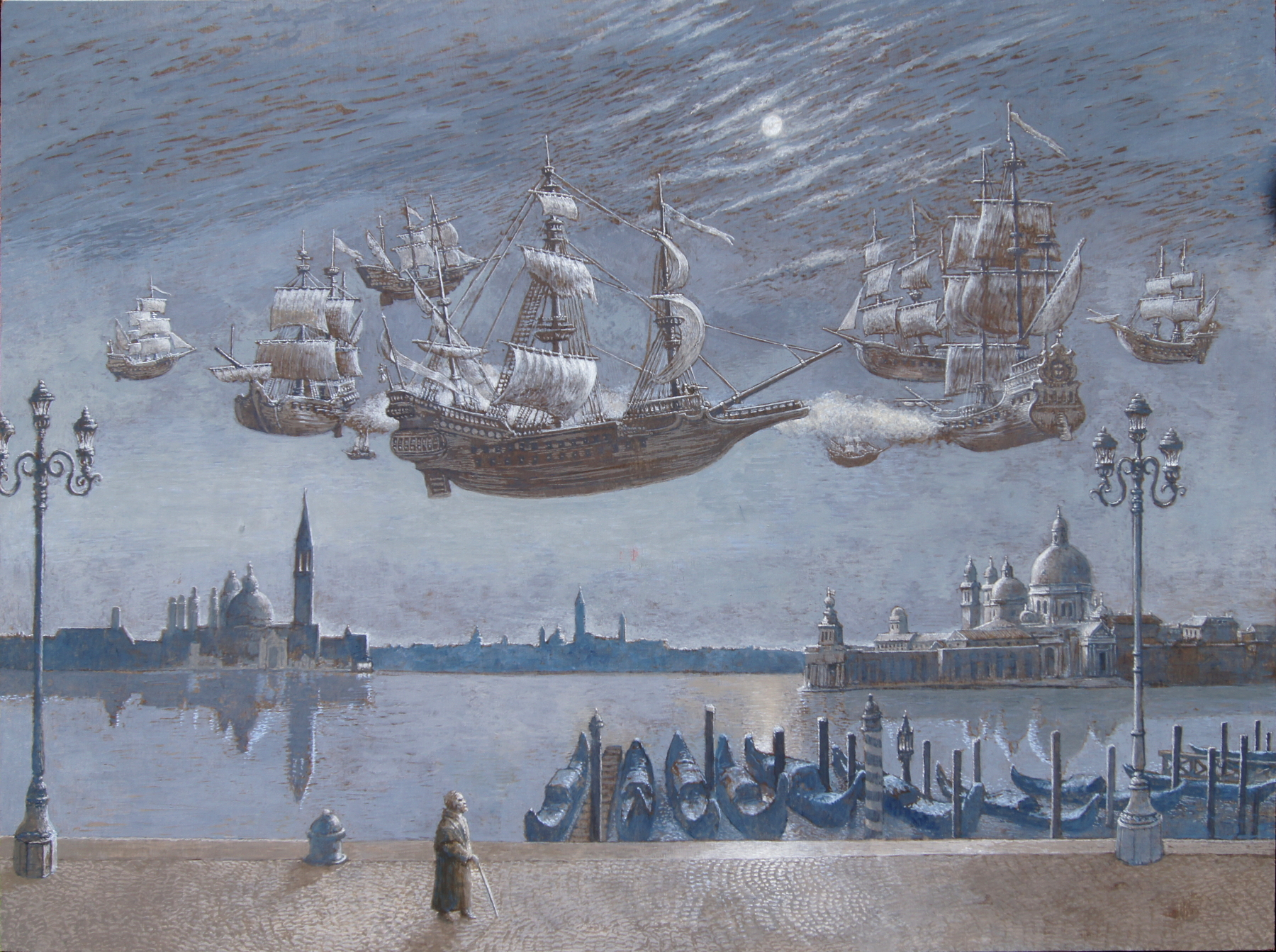
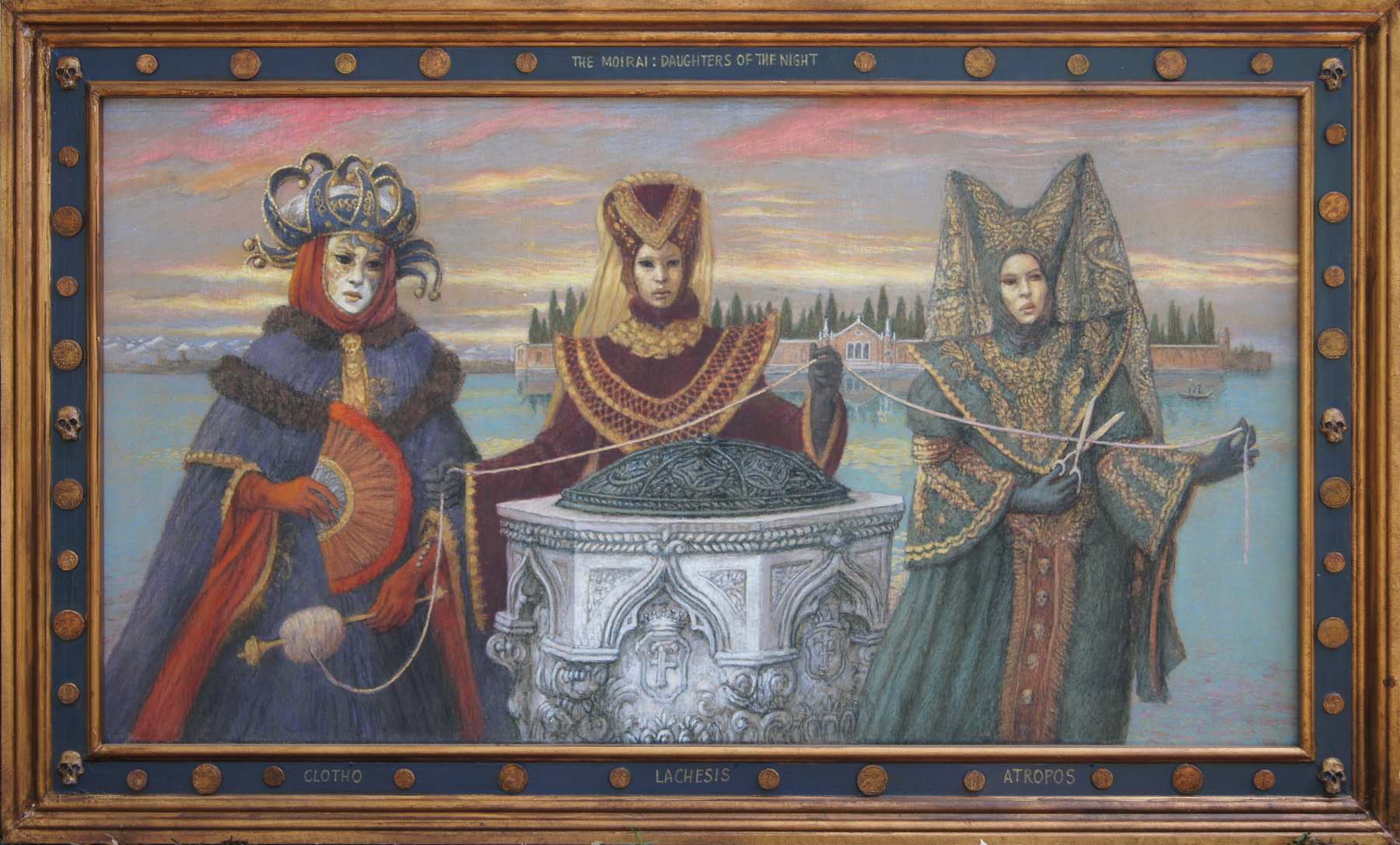
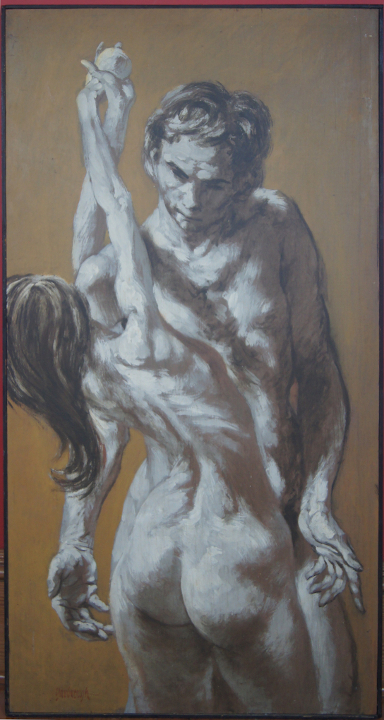
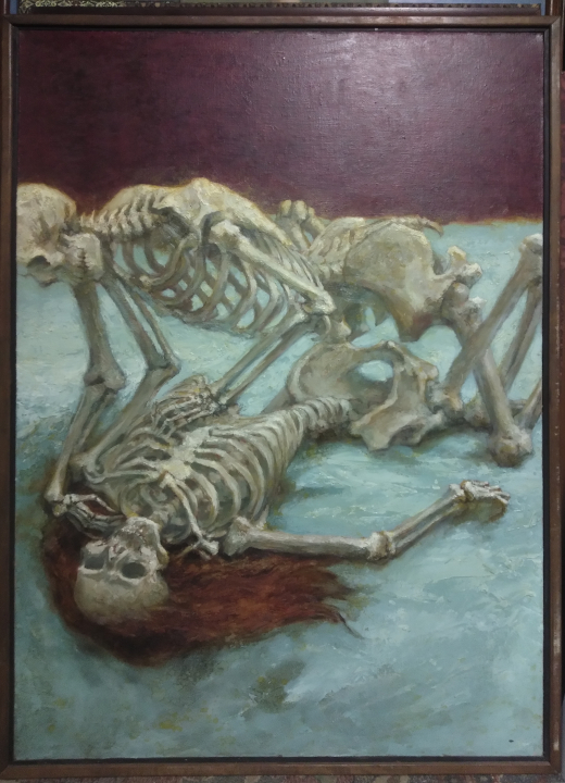
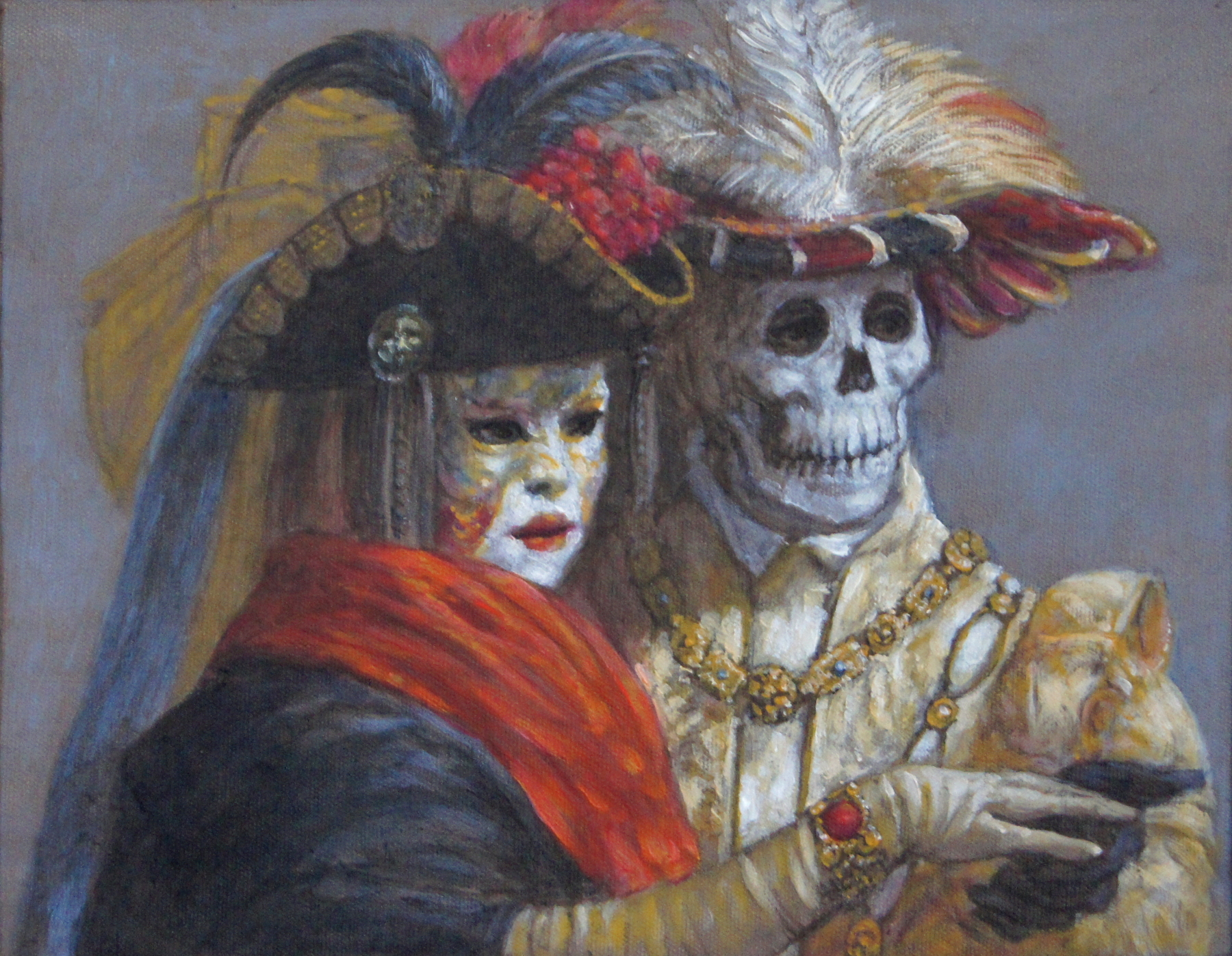
How to Make True Gesso

With Jim Yarbrough

Jim’s first video is not actually his first. Back in 1979 or so, someone made a video of him doing art in his studio. (Not the current studio.) There’s no sound, it’s on 8mm film, and it runs for 9 minutes. We have the only copy, I’m not going to digitize it. And back a couple of years ago Jim decided he wanted to do a video of his process for painting a triptych, so I set up the camera and did a time lapse of the whole process, including filming of him painting in realtime, and capturing some of his intended monologue. But because I had too much trouble getting the clips off my phone, nothing ever happened with it, so oh well. This year he decided he wanted to show people how to make real rabbit skin glue gesso, something he’s been doing for decades. So we did. And tho it took forever (two months) to edit and narrate it, it’s finished, and it’s up on youtube, and this blog post is about the process, a description of what you see in the video, and a list of suppliers so you can make your own gesso.

Ingredients

you’ll need to have access to a stove, a double boiler, a nice soft big brush, and the following ingredients – water, rabbit skin glue, marble dust or chalk, white pigment (titanium or zinc white), and kaolin clay.

(We got our double boiler many years ago in a thrift store)

Process

Put an inch or two of water in the bottom pot of a double boiler, and set it on the stove to boil. Put a quart of water into the top pot, and set it on the bottom pot to warm up.

Once it’s good and hot, turn off the heat under the double boiler. Into the top pot, stir in 5 heaping tablespoons of rabbit skin glue crystals. Stir until dissolved, and let the pot sit out for several hours or overnight. It takes some time for the glue to dissolve and thicken.

Once cooled and thickened to a consistency somewhere between milk and hot chocolate, measure out and stir in the various fillers. The amounts can vary considerably, and to your taste. As always, experimenting with your materials until you know them is essential for making art that will last.

Here’s the recipe Jim used to make the gesso in the video.

5 heaping tablespoons of marble dust. marble dust, chalk, whiting, calcium carbonate. The marble dust Jim used for this demonstration was not as fine as many other bags of marble dust we’ve bought. It was coarse enough that he found it ideal for use as a surface for pastel paintings. I think most people, when they use rabbit skin glue to gesso a surface, will go to great lengths to end up with a very smooth surface. For oil paintings and watercolors especially. Lengths like sanding and scraping with a razor blade. Jim doesn’t do this, because he just wants a surface to paint on. But everybody has their own ways in this, because gesso goes back to medieval times.

3 heaping tablespoons of pigment, usually white. In this case, Jim is using zinc, probably because he’s running out of titanium white (I’ll order more soon). You can use either white; titanium is more opaque than zinc and so it’s better for this purpose, since you’re looking to cover as well as size the painting surface. Jim frequently uses a toned ground, which is just a matter of mixing in some dry pigment to taste, or even using premixed tube paint. Colors used for toned grounds can be raw umber, or a mix of raw umber and ultramarine, or any lightish grayed color, like raw sienna or even a green.

4 heaping tablespoons of kaolin clay. Jim loves using clay in his mixtures. His most popular post is “How to make your own clayboard“. Kaolin is used in cosmetics and food and drugs. You can dig it right out of the ground if you’re near a deposit (yes, we have some hand-dug kaolin).

For those who don’t have a double boiler in your studio, there are lots of workarounds. And here are a few double boilers, because they’re just so damned handy in the kitchen.

And if you don’t already have a big soft brush to apply your gesso, then you should get one, because a stiff bristle brush will leave marks, and a small brush will take forever. I’d get at least a 1″ brush. But Jim is using a goat hair brush – very soft hair – called a hake brush. This one is 3 inches wide.

Here are some sources for these materials:

rabbit skin glue – it seems to be thin on the ground these days. last year there was a shortage of many glues, due to supply chain issues. Anyway, I found it available at dick blick, natural pigments, amazon, and ebay, and of those, I would trust the actual art supply store

marble dust – another hard to find product. I’m not sure if this is linked to a shortage of quarried marble for headstones, due to the rona. natural pigments has it, tho, and you have to be thorough on amazon and ebay because you don’t want coarse marble dust unless you’re making pastel ground, and so on

white pigment – here are links to titanium white suppliers. You can check for zinc white at these places, if you prefer it. Again, natural pigments has the best source, tho amazon has it too, and so does ebay. but you have to be careful, again, to get the right formulation, the right size particles, and other details that take research. suppliers of art supplies have already done a lot of the research for you, so unless you have some experience, or can research until you know what you’re looking at, it’s best to avoid all purpose websites that sell everything

kaolin clay – except when it comes to things that are in themselves all purpose. Like kaolin. It’s used in everything, from art to science. The bulk of kaolin is used in papermaking, but it really is everywhere. So you can readily find it on ebay and amazon, where you’ll see it advertised as a cosmetic. But natural pigments also carries it. We’ve gotten it from every source.

Process

One day in late July, Jim turned to me and said, “I’ve been thinking about making a video on how to make gesso.” And me, not knowing how many dozens of videos are already out there, said, “Sure thing.”

But we’d been down that road before.

This time we called in the cavalry. Our good friend Margaret Dyer, a noted painter and teacher, and someone who makes bunches of videos about how to paint in pastel and oil. She happened to be between workshops and demonstrations, so she came over to Jim’s studio, and we spent a morning filming. She mostly filmed, I took snapshots and filmed from different angles, and – most importantly – took notes.

And then – even better – Margaret took the videos home and strung them together, and did a little voiceover, all just to show me what could be done with the material. So I took it from there, and basically refilmed the entire thing. It was fun. Jim mixed up his gesso, and then painted his panel layer after layer, until it was a nice smooth white surface. It took days to get all the coats on, with me filming and snapping photos the whole time. Except for one afternoon when he neglected to tell me he was going down to put on another coat. All I’ve got for that coat is a couple of after pictures.

Be that as it may. Here’s Jim’s first coat of gesso, the board gleaming wet. You can see even in this badly lit, oblique view, that it’s streaky af.

And when it dries it’s just as ugly. Someone remind me why we can’t put on thicker coats of gesso (hint: they crack)

This is what it looks like close up. Those individual grains are actually bits of marble that weren’t ground as fine as they could have been. This will leave a sandpaper texture on the board, and Jim will consequently use it for his pastel paintings.

Something that’s always fun when you’re layering on paint is a thing call creep. The second coat is creeping over the first one, beading up, refusing to make an actual coat that clings together. This could be troublesome for various reasons, but in this case it doesn’t matter at all.

But I think it looks cool, and there are situations where you like the effect of beading up. Nice texture.

This is Jim at the end of his second coat of gesso. Almost time for coffee.

You can start to see some buildup, even with only two coats. The pitting is a different phenomena from the bumps, btw.

And this is the third coat. Still way streaky, but then it’s early. Some artists use a dozen or more coats of gesso to prime their panels.

More crawling. I tried, you can make the paint film adhere if you go over it with your brush, but it’s okay because you’re going to go over it again with fresh gesso when this coat dries.

The third coat is on. You’ll notice that Jim does not tend to vary the direction of his stoke much at all, and it really shows. You’re supposed to go at least 90 degrees to the coat before, but with a bit 3×4 foot board, there’s not that much room to maneuver, and he is just going to keep adding more coats until he can’t see any of that streaking, which is the point.

Third coat dry. Less streaky, but not really.

The fourth coat going on now.

Fourth coat closeup showing bubbles now, more than sandy grains. You might normally sand each coat or two to keep the bubbles from mattering. They tend to make absorbent pools that catch the paint, but again, Jim doesn’t care about that.

And that’s the last coat of the day. Let that dry, and come back and do more in the morning. We’re approximately halfway done.

Next day, a closeup shot to show how, even tho it’s still streaky, it’s mostly covered, just not evenly enough.

And a closeup shot showing a gradually thickening layer of gesso pooling on the surface.

More crawling. I like it here because it’s harmless. If it happened with the paint layer, I’d be tripping out.

Another coat close up, could be 5 or 6 at this point.

And also dry and getting fairly thick now. You can’t see streaking anymore

This is the seventh coat. It’s almost done. I can’t tell the difference, but Jim thinks just one more coat will do it.

This is the panel in closeup, with all sorts of variations in the brushwork even tho he didn’t try to do it that way. It makes an interesting surface for pastel, and he’ll even paint something with egg/oil tempera at some point, because he likes a rough surface. Otherwise, having hit it with a sanding block every coat or two, it would be very smooth and have the same character all over the board.

This is the 7th coat, finished and dry

So now Jim is putting the last coat on, it’s late in the afternoon and his back is tired from all these broad strokes. The board is sufficiently covered that it looks white; the wood is now protected from whatever he chooses to put on it, and he’ll be ready to go once it’s dry.

Not so many craters now, you’ll notice. Lots of bumps, because he’s got very sandy marble dust, but the craters have all filled in. And there’s no sign of creeping in the layers.

And that’s what it looks like when it’s done. Just a plain white sheet of wood, ready for the paint. It took three days, and about 2-3 per day, and he had enough gesso to do half of it, so had to make two batches.

+++++

The panel has long since been coated out and ready for painting, and I was still working on post production for the video. Boy what a lot of work goes into editing and narration. And boy can I not stand the sound of my own voice. I had to download (and learn) two different software programs in order to finish the video. They’re both straightforward for complex audio and video manipulation programs, and I stuck to only the very basic techniques, but still managed to get stuck every time I had to do something different. But gradually I learned how to cut pieces out of video clips, and how to record and discard the same voiceover snippet over and over again.

The day came when I finished stringing together all the clips of Jim making gesso and then putting the first coat on a masonite panel. And I’d buckled down and taped all the narration, and stuck it into the video editing program, and it was time to test it out, see how it looked and sounded. Because I was having some issues getting the playback to run smoothly. Every time it hit a transition between one clip and another, the video would slow way down, and the audio would break up and stutter. So I wanted to see how it worked as a video. And knowing nothing of how video works, I went along with the presets, and started the export.

It was like molasses going uphill in February. So I left the computer running and went to do something else. It was a while before I noticed that there was no editing program up on my screen. I checked, but there was no freshly minted video file in the folder. So it crashed. I rebooted, started the program up again, and sat there while it worked on exporting the video, and watched it crash this time. At this point I RTFM and looked up the proper settings for a youtube video, and tried it again.

Okay, that worked: I got a file. But not so fast. It played when I clicked on it, but it was a screen full of lines and no audio. So, no. Experimentation and research continued.

And continue it did until I finally got the video to export. It’s still got some trouble, and we are by no means looking like professional video creators at this point, but here it is. I’ve loaded it up to a new channel on YouTube, and you can find it here

And continue it did until I finally got the video to export. It’s still got some trouble, and we are by no means looking like professional video creators at this point, but here it is. I’ve loaded it up to a new channel on YouTube, and you can find it here

Project: Public Art Utility Box

Jim and the wife painted one utility box in our neighborhood. You can see the post here. The unpainted ones looked nasty compared to them, so we made some plans, and started in on the second and third box. He did this one from start to finish.

Washing years of dirt and mold covered the box, so borax and ammonia and a scrub brush. It took an hour or two.

Two coats of high quality primer did not cover the graffiti. But he intended to cover everything anyway, so that was good enough.

He had a drawing he’d made when first thinking about the idea. Jim has done a lot of puppets and ventriloquists in his time, and so he didn’t need a model, and already was familiar with the traditional composition.

He thought the caption was quite amusing. The wife took a minute to understand the joke. Some neighbors are still bewildered. Someone noticed a type, but it actually made some sense, so he left it.

He ended up using porch and deck enamel for the background. He didn’t have that much tube red, and porch paint is pretty tough.

All this took days. The weather was in the upper 80s, but the site is shaded until late afternoon, when we’re taking a nap anyway.

Professional artist acrylics would have covered better than the porch paint. he used three or four coats to get it past the streaky stage. The photo below is not yet at that stage.

The observant reader will notice a chair leg Jim forgot to draw in, but since this is opaque paint, it’s easy to fix mistakes like this.

It’s wonderful what you can accomplish with a limited palette. Jim is using let’s say burnt sienna, maybe napthol red for the background, yellow ochre, burnt umber, and perhaps a touch of ultramarine. And that’s it.

Finally, the painting finished, he took acrylic varnish and painted it on to protect the painting from all the stuff that’s going to happen to it now.

Jim regularly went across the street to see how it looked. You design these things to be read at 30 feet, where the level of detail and the color juxtaposition becomes a much different problem than at 5 or 10 feet.

And this is the final product. A different kind of phone box; we think more interesting than bright colored abstracts and flowers.

Second round of miniature paintings for your viewing pleasure

Last month we put up a bunch of miniature paintings over on Etsy, and lo and behold we sold two of them.  Who’d a thunk it?  Jim is continuing to make miniatures of this plague year, but the most recent painting he is working on is a much larger one, perhaps 30″x18″, and is much too complex to make into a miniature.  He is planning to take certain parts of it and make miniatures from it, but this particular painting has everything – Indian goddess barflies, drunk or dead patrons, heads in bottles, and a bartender of Death.  Here’s a picture.

And here are the latest of his miniature Death paintings.  For this batch, he went a little further afield than the first time.  He’s still doing dancers, but they’re not all bellydancers.  He’s got ballet dancers, and a bunch of modern dancers, as well as a couple of paintings featuring our local cemetery, and a very disturbing lynching.  Personally, I hate that last one, but he saw the need to make a commentary on that particularly heinous form of death, given the times we’re in, and the recent upsurge of violence against people of color.

The painting titles have links to their page on Etsy for a larger photo and more details.  Because they’re miniatures, they’re quite small – the picture surface measures no larger than 25 square inches.  There is a lot of detail in them because Jim is working in egg tempera, with absolutely tiny little brushes, and using magnifying glasses in order to see and work on the surface.  The paintings are very delicate in their attention to detail, and they all bear a closer look.  Enjoy them, and please let Jim know what you think in a comment.

Dance Troupe of Death

This painting is unusual for the series in that all six figures are skeletons.  Usually Jim paints at least one human, presumably being infected, or marshaled toward death, by the skeleton(s) in the scene.  He actually derived this particular composition from a larger painting (not in this series) with many more dancers, including a self portrait.  But that composition was far too complex to attempt at miniature scale, so here we are.

Death in Costume with Funerary Urn and Birdcage

This scene was inspired at our local cemetery, and features a magnificent Victorian urn.  BITD the Victorians had a thing for death, and visited their cemeteries for picnics and celebrations.  People got dressed up, and paraded around admiring all the richly decorated tombstones and monuments.  So of course Jim thought of Death promenading past this enormous urn we found, and wanted to make a painting of it.  This painting is unusual, again, for lack of live human figures.  But perhaps for Death, the thought of a big urn stuffed with souls is enough.

Belly Dancer of Death with Sword and Head (Self-Portrait)

Okay maybe he didn’t intend it as a self portrait, but it totally resembles him.  Jim often puts quite a lot of himself into his figures, such that all his men look like him, and his women don’t look like anybody in particular (and certainly not the model).  His unconscious self portraits appear in many of his paintings, and he doesn’t seem to recognize them as such until they’re pointed out.  At that point he just shrugs.  I think it’s funny.

Belly dancers often use props such as fire and swords in their dancing.  Jim has painted this theme several times.  This painting combines ritual sword dancing with one of my favorite subjects – judith and holofernes.

Happy Dancers all Unaware

In this painting, the dancers toss silk shrouds as if preparing to throw nets.  But there is Death, dancing with them, turning every movement into a threat.  Another eastern dance theme, something Jim has gone back to time and again during his entire 60+ year career.  When we finally visited India, we didn’t go to see any dance performances, and saw only ancient carved dancers on ancient stone temples, but he’d studied the tradition so closely he almost knew their names.

Death Attends a Lynching

This is not my favorite painting.  An old fashioned lawman has just finished stringing up some poor guy, attended and egged on by the angry, violent mob.  Death stands at his elbow, not just encouraging him, but preparing to drag him off next.  Evil people die too, and neither their righteous pretense, nor the trappings of authority, does them any good.

Dragon of Death

This is more my taste in paintings.  A group of dancers totally freak out when their ornamental dragon head comes to life and threatens to eat them.  In this painting there are no skeletons, as Jim felt that an avenging dragon is symbol enough of death and destruction.  The dancers start out thinking they control the dragon as merely a prop and a symbol, but they soon realize the power of the dragon unleashed, and try to flee, but we can guess how well that’s going to turn out…

Dancer to a Fatal Tune

Jim once again cheerfully mixes genres to make his point.  A woman in bellydance costume stands in an arabesque as men play stringed instruments behind her; death plays a mean cello, and some guy perhaps far enough away not to catch the rona is playing a violin.  I get the impression that this moment went on like this forever – she standing there waiting to catch her death, while the flute player edges off the stage to get away from the cello player.

Death in the Confederate Cemetery 2

Death as a confederate soldier, having a good set in the shade with old comrades.  This scene is taken from our cemetery, which has quite a few civil war graves.  Jim imagines, as we walk past the gravestones, the ghosts of all those soldiers stirring, watching our tumultuous present with bemusement.

Death in the Confederate Cemetery 1

While not framed in the same moulding as the first in this duo, the subjects are so similar that I’m at a loss what to call them.  IDK, maybe Death is waiting for someone to come along walking their dog off the leash or something.  Who can say what goes on in the mind of an artist when they’re painting – not the artist themself, that’s for certain.

There you go, Jim’s latest miniatures.  He’s going to do more, but right now he’s distracted by the idea of making a youtube video to show people how to make things the renaissance way – like egg tempera, and gesso, and clayboard, and encaustic medium.  I’ve taken a test video of him making egg tempera, and so far i’ve researched the various editing software for my computer, and just have to find one that works and that i can figure out how to work (two different issues)

In the next blog post, i’ll be showing a bunch of larger paintings that we’ve got up on Etsy.  The water paintings.  They’re just all the paintings i’ve cataloged that have water as their theme (there are loads more that haven’t yet been cataloged).  Jim has painted a whole bunch of water in his years – koi paintings, ponds and pools, beaches, submerged and distorted figures, and I wanted to start getting them online so people could appreciate them.

A Plague Year – miniatures for our times

Jim’s been occupying his time during the covid lockdown in his usual way.  Many people are at loose ends during this time of staying at home, but Jim always stays at home, and spends every day down in his studio, doing what he always does.  It’s only his subject matter that has changed, reflecting the widespread concern for the future, and our growing understanding of what about our daily lives is essential and what is not really very important at all.

In the past few years, Jim has become more interested in showing his work, and so we’ve been submitting to various art shows and competitions.  For last year’s season, he was accepted into two shows of miniature works, for which he only had paintings he did twenty or thirty years ago.  So he became interested in painting some more.

He looks kind of odd in his closeup glasses, but he doesn’t mind, because otherwise he couldn’t see what he was doing.  He’s using 5-0 brushes (the smallest of the small), and he’s painting on tiny little panels, using egg tempera as his medium because it’s the best paint to use when you’re doing incredibly small details.  Practically nobody paints in egg tempera any more, and he was quite bemused to find, reading thru the catalogs of the two shows he was in, that he was the only tempera painter.  There was a miniature painters society in Atlanta all those years ago, but they all died.  Tempera was what they used back in the days before oil painting was invented, and even tho it’s a dying art now, he is a master in that medium, and paints both large paintings and tiny ones mixing egg and oil medium with his dry pigments, the same way it was done hundreds of years ago.

This series of paintings, which is ongoing, is all about life and death.  Death stalks us all, and death is among us all the time.  Now that we are all facing death by coronavirus, it’s made us more aware of the closeness and everpresence of death.  What these paintings all have in common is death, symbolized by a skeleton.  In some cases, death is ready to pounce on a person and carry them off, but in other cases death is unrecognized in someone not yet dead, someone already infected and marked for death who nonetheless goes about their daily activities while infecting others.  Since the series continues, with Jim painting one every couple of days, there will be another post showing the latest of the latest, but there are quite a few now, and he thought his friends would be interested in seeing what he’s been up to.

There are links on each painting to the website where they’re listed for sale.  It’s something we’re only starting to do, so it’s quite experimental and rough-edged.  But the gallery system is not very viable at this point, and we’ve been encouraged by the worldwide response to his work here on this blog.

We would be writing this blog in his voice, but he’s too busy to write up detailed descriptions of his paintings, and prefers to present them on their own anyway.   As his wife, I’m not troubled by putting words into his mouth, and have had many conversations with him as to his motivation, the symbolism, and the meanings he has revealed to me as we talk about his work.

He’s also working on a couple of youtube how-to videos, how to egg tempera, how to miniature painting.  That’s a much slower process, and depends way too much on me learning video editing software.

The skeleton he’s been using is an old friend of Jim’s.  We found him in someone’s discard pile, years ago, and he’s been resting in the attic whenever Jim turns to something else.  But whenever it’s time to do another death scene, we carefully disinter him and bring him down to the studio, where Jim props him up, wires his hands in place, and starts drawing him.  We call him Senor Posada, after the Mexican artist who popularized skeletons in his work.

Here is a small show of all the work he’s completed to date (mid-April).  While he rejected the title of Dance of Death, as having been used before (Breugel), so he finally came up with Pictures for a Plague Year.  The captions are mostly the ones I thought up for his Etsy page, and I’m no good at recycling the same phrases over and over, so they get more spare as the sequence goes on.

Self portrait with death and ghosts.

Starting with a self portrait, which is how the series started.  When he first started painting these miniatures, he wasn’t consciously commenting on the virus pandemic.  He was simply wanted to make a miniature, and decided to start with a self portrait.  Artists should regularly do self-portraits, just as a matter of general operating principles.  It keeps your hand in, and helps chart all the added wrinkles and features time brings.  As he was thinking about his self-portrait, he decided to go with the same imagery as many pre-renaissance artists used, like hans holbein.  So he decided to add a bunch of spirits, and after discussing it with me, he decided maybe they were the ghosts of people in his past.  We’ve had a model skeleton for some years, who usually haunts the attic, so we brought him down to the studio, and set him up as a model for all the following paintings.  This picture shows jim making his self portrait, drawing himself on a small board while looking into a mirror.

After that, we sat down at the computer and found a whole mess of photos of indian dancers, because he has a fascination with indian figures.  He’s had this fascination for many years before we went to india last year, and he chose dancers from india partly because he had a lot of source pictures of indian dancers just lying around, and thought these pictures could be adapted to the series.  He’s done a lot of belly dancer paintings over the years, and so he’s got a lot of source pictures.

one of the things that strikes both of us is that the western tradition doesn’t usually mix dancers with musicians.  in ballet and modern dance, as in opera, the musicians are either electronic, or hidden away in a pit.  you have to go to different cultures if you want to actually see the dancers and the musicians together.  Flamenco, indian dance, asian dance, folk dancing – they all have blended stages.  but rap music?  no.  rock?  no.  country music?  not unless you count line dancing…  Bollywood musicals are one place where you don’t find musicians shown on the same stage as the dancers.  it’s very westernized that way.

Bollywood dance scene of death.

In this painting, there are two skeletons – representing death – dancing in the same line with three live dancers.  I asked Jim what the significance of the skeletons were, and he was vague about it, as he always is when you ask him what he was thinking when he painted something.  But he did allow that it’s supposed to be ambiguous.  Death is either represented as death come to get the dancers, or as someone still alive, but who has been marked for death, and whose function in the group is to infect everybody else.  Your choice.

Bollywood dance of death.

This is from an actual Bollywood movie, obtained by an internet image search.  The leading skeleton and leading lady, dressed in black, are all happy and in love, and it looks like everything will end well, as those movies usually do.  Bollywood movies always have at least one dance scene, and the dance is always about how happy they are, even if the plot is a downer.  It’ll end up with the boy getting the girl, of course, because that’s the rule.  But in the background there’s another skeleton figure dancing with the background dancers, and her story arc isn’t mentioned.  But she’s there to infect the other dancers, guaranteeing the happy couple an entourage in the afterlife.  Or something.

Battle of the sitar players

Life and Death battle musically for the future of an Indian dancer. Death, playing a sitar opposite Life, both of them vying to be the dominant texture in the song they are playing together, while the dancer flows with the music, unaware of the epic battle going on beside her. The music isn’t discordant, but rather a complex and coordinated statement of the way of all nature.

The song’s ending

A female sitar player finishing her song – a raga – lost in the music and unaware that Death is waiting impatiently right beside her. Death’s arm is brushing her back, and he is almost touching her face. Perhaps he is enjoying her last song as much as she is.

Dancing for death

Death in the form of ancient man is playing the sitar for an Indian belly dancer. It is unclear whether she is aware of the presence of Death and is dancing to save her life, or if she’s aware he’s come for her and is dancing her last dance in full knowledge of her impending death.

Death and the flamenco dancer

A Flamenco dancer performs to a tune Death calls on his guitar. Her long flowing scarf may look like wings, and she can stamp and twirl all she wants, but there is no escaping the music Death plays. She may realize it’s Death serenading her, or she might not, but this will be her last performance.

A wall of death listens to sitar music

In a strange twist to the Dance of Death Theme, a sitar player performs for a wall of death. Figures of Death can be seen ministering to important people in various panels of the painted wall behind the musician. Everybody, rich and important or poor and unnoticed, have to go when Death comes to fetch them.

Death plays an irresistible tune

Death, smoking a cigarette, plays guitar for a dancer. The bright colors of her dress symbolize the flow of life, so vibrant within her, while the cool blues of the skeleton and background symbolize entropy, the running down of energy into death. The dancer may or may not be aware that Death is strumming the tune she is dancing to, but that hardly matters, as Death plays for us all anyway.

Dancing death

Death is dancing to the music of a female sitar player. The vibrant background makes everything seem alive, but the dancer is definitely dead, and the musician will soon be dead as well. Dance lively while you have the chance, because Death dances for us all.

Technical note: tho you can’t see it on the photograph, the dancer’s dress and veil have glitter adorning them.

Bring out your dead

Death walks a bedraggled old horse pulling a cart full of bodies. It’s an illustration of Monty Python’s gag about the Black Plague, where the dead were collected from peoples’ houses every day as the cart driver shouted ‘Bring out your dead’ as he went thru the streets.

Death lends a hand

Death dances with everyone, and you can’t avoid it. Here an oriental dancer must dance with death to complete the performance. Does she recognize what will happen, or who she’s really dancing with?

Arguing with Death

An old lady has been waiting to die. When Death finally shows up, he messes around on his cellphone. Finally, the woman shows him it’s time to go, but he doesn’t seem to be ready. There’s another way to read this – Death is watching his accurate phone clock to make sure it’s the right time to take the old woman, but she is impatient, and argues using her old fashioned timer that she should already be gone.

A family of dancers.  And Death

Death plays a sitar, while a mother and her child dance to his tune. The woman has been dancing for many years, the child is only beginning, but this is the last dance either of them will perform. Death will finish his tune, and they will follow.

Erotic Art Show Feb 13

IMG_20200202_142233


344 Candler Park Dr, Atlanta, GA 30307
Thursday, Feb 13, 7:30pm
Admission $20

This is an annual show in Candler Park, Atlanta, and Jim’s work is featured, but by no means all that is being shown.  Because this is a family page hahahahaha, we’re not going to put up quite the most erotic of his paintings, but here’s a small sample.

IMG_20200203_112441sDSC05115IMG_20200126_173405s

By jeanne Posted in art

A Grant Application

It’s been awhile since Jim has posted anything (my fault, really, because he doesn’t care for computers).  We’ve been traveling, and if you’d like to see what we’ve been up to, you can have a look at our travel blog, here.

The main reason for this post, instead of trying to catch everybody up on Jim’s latest works, is because we’ve just had to put a bunch of effort into applying for a grant for under-appreciated artists, of which Jim is a prime example.

He chose a Venice theme because the organization wanted a body of work, and not simply the latest paintings.  Jim has been painting Venice since the ’60s, and since we started visiting it in 2015, he’s concentrated on it more and more.  No other subject gives him the room for such embellishment and detail.

So here is Jim’s art statement from the application, as well as the paintings he has submitted for consideration.  Hope you enjoy them.

Artist’s Statement:

Symbolic representation is limited by our culture’s preference for fashion. Classical mythology holds little currency with a modern audience, and organized religion is reluctant to see the entertainment value in its message. Much of contemporary art poses the timeless questions by recasting myths in a fantasy or science fiction universe. But I prefer to speak directly to the Church about its role in the present paradigm, to bare the roots of the challenges facing us now.

I have chosen a Carnival/Lent theme for many of the paintings in this series, and make use of elaborate costumes to emphasize the subtle variation of self-expression that are possible within rigidly imposed social boundaries. The masks and costumes of my figures are their deliberate disguises, at odds with the people underneath, who use elaborate vestments to create fictitious characters, the same way we costume our everyday lives.

I began to be interested in painting both the architecture and the costumes of earlier times in the late 1950s. When the Carnival celebrations were revived in Venice in the late 1970s it was a perfect match for my inclinations. But it was several years before my wife and I made the journey. My first trip to Venice at Carnival was like living in reality and my imagination at the same time. I have a particular affection for the art and the artists of renaissance Venice that serves me well in my studies of Venice today.

My first experience with egg tempera was in art school in the late ‘50s and I have gradually done a larger portion of my work in that medium. This requires making my own paint in the studio as part of the painting process and I have continued in this direction. In a way, I could almost be categorized as an anti-contemporary painter, as my studio functions more like a renaissance studio, with handmade paints, hand prepared painting surfaces, customized handbuilt frames, and traditional materials.

The one painting I would like to comment on is the one entitled “Self Portrait in the House of Gold”, as it has a special place in my memories. I had begun this painting before visiting Venice, entranced by the beauty of detail in the portico and courtyard of a palazzo I had no knowledge of. Within a few days of our departure from Venice, we ran across this very house – the famous Ca’ D’Oro, and recognized the scene when we peered through a crack in the wooden gates. On touring the palazzo, I realized that the complexity of the scene was far greater than the photograph I had been working from in the studio. When I returned to my studio, I was able to add much of the detail I had studied on the spot, resulting in a much more satisfying painting.

SONY DSC
Swirling Memories, a portrait of our friend Marie, who joined us for Carnival

SONY DSC
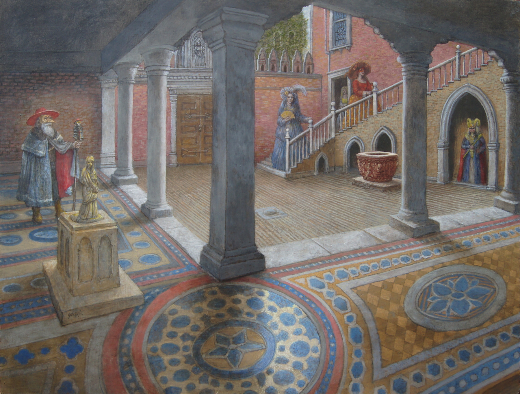
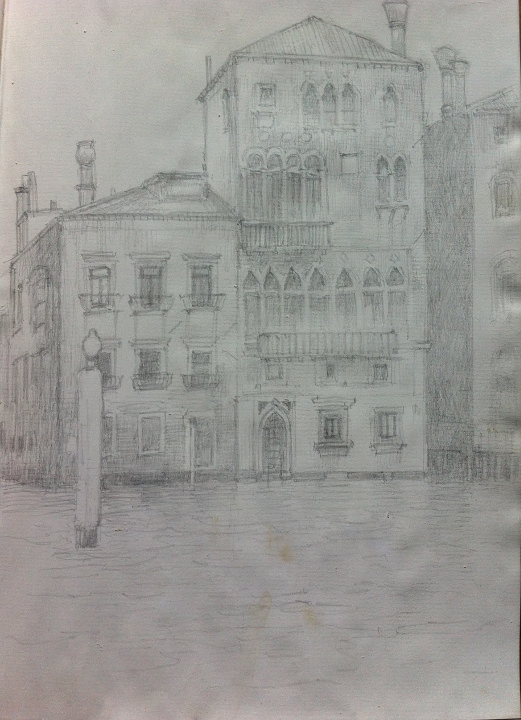
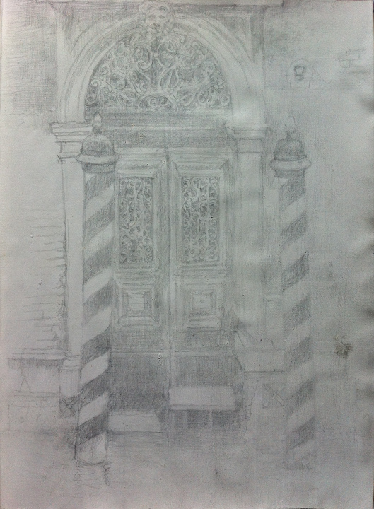
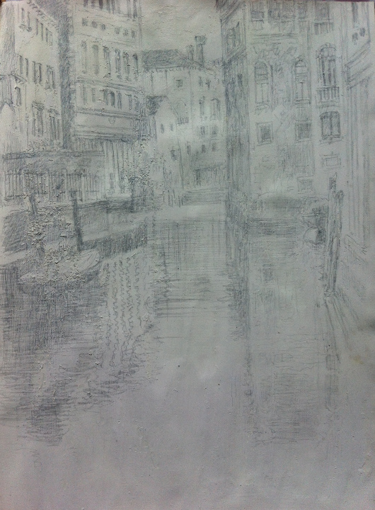
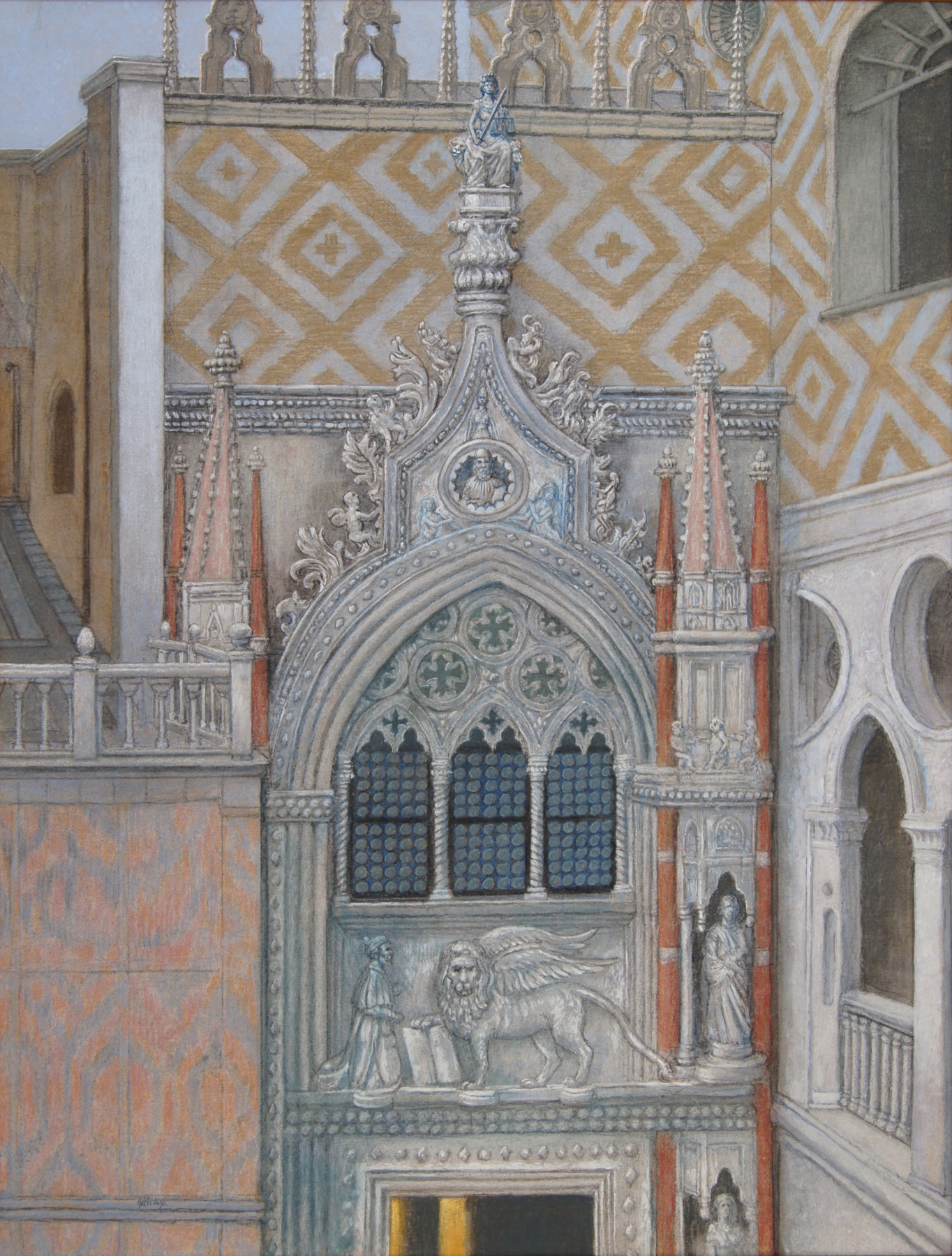
Porta Della Carta, the entrance to the Doge’s Palace, one of the few of his paintings without a human subject

SONY DSC
Under the Rialto, during an episode of acqua alta, when the streets look like the canals

SONY DSC
Still Water Runs Shallow – in Venice, anyway

SONY DSC
Nocturne of Old Age, a fantasy painting, because Venice is so beautiful at night, and because we’d visited the Maritime Museum and Jim wanted to paint the old ships

SONY DSC
Self-Portrait in the House of Gold – there’s a great story about this painting, begun before we left for Venice, and finished afterwards.  Jim is the guy in the costume on the left

SONY DSC
The Fates of Venice – please note the handmade frame with cast medallions

8 Venetian Attitude
Venetian Attitude.  In old Venice, the courtesans were required to wear yellow

9 Lady with Many Secrets
Lady with Many Secrets, not the least of which is the man lurking in the background – nobody we’ve shown this to notices him

10 The Church of Anonymity
The Church of Anonymity.  A triptych from before our first trip to Venice, when Jim used the National Cathedral in Washington DC for the interior


Pastels painted in Venice

As a matter of record, I’ve been meaning to make this post since returning from Venice, in April of 2016.  But it’s taken awhile.  Here are all the pastels I painted while I was in Venice this past winter.  My wife has written elsewhere about our trip, and has her own blog for her own work.  This blog entry is all about the work I did while I was in Venice for three months.  I have already written a post about the first half-dozen or dozen pastels, so I’ll try not to repeat myself too much here.

SONY DSC

This is the first painting I did in Venice.  It’s the bridge to Sant’Elena, where we stayed.  I worked on a piece of handmade paper that I had pulled myself in preparation to our trip.

SONY DSC

Then I did a painting on handmade paper of the bridge going from Giardini to the Riva dei Sette Martiri, near sunset.

SONY DSC

I’m not entirely sure of the order in which I painted these pieces at this point.  The earlier post is sure to have it more correctly, since it was done at the time.  This one is of one of the smaller side canals, with gondolas.  This one might have been done on a half sheet of Fabriano watercolor paper, I’m not sure.

SONY DSC

I did this one on oval handmade paper.  I had my son Michael build me an oval papermaking frame.  The scene is the Grand Canal just at the Rialto Market.

SONY DSC

This view was one we stumbled upon in our walks.  That’s the Salute church in the background, and a gondola stand in the foreground.  Handmade paper.

SONY DSC

Everybody’s favorite painting, this one is on handmade paper, and it’s of the tide coming in over the steps along the waterfront at Giardini, I’m pretty sure.

SONY DSC

At the end of January there is a costumed boat regatta down rio Canareggio, and we attended, taking many many photos.  I couldn’t resist doing this rather large painting, from a half sheet of Fabriano.  That’s me in the red cape.

SONY DSC

This lady was one of the costumed figures we saw in San Marco during Carnivale.  She was actually just returning to her rented apartment after posing all morning, and we happened to get a shot of her, and her friends.  Their apartment was right next to the Contarini Palace, with the fabulous Scala Bovolo, and I vowed to make a panting of the scene.  I used a half sheet of Fabriano for this.

SONY DSC

These are then studies for the painting of the Bovolo.  These figures all rented the apartment, and we hope they enjoyed seeing themselves painted in like this.

SONY DSC

Another study, again on handmade paper.

SONY DSC

And using a full sheet of Fabriano paper (something like 20″x30″), I put them all together in one painting.

Now to move on to cover the pastels painted from mid-February to mid-April, when we returned home.  In general, I used the larger sized paper; 8.5×11 or 11×17 just wasn’t enough anymore.  All along, my tools had been a choice of handmade or commercial paper, and a selection of pastels.  I started my drawings with graphite sticks and conte crayons.  I used soft pastels that I had bought over the years.  There were pastel pencils for detail work.  There was a specially made range of blues that I had made right before coming to Venice, and then left at home, so our friend Marie Matthews graciously collected them for the studio before coming to visit.  And my wife brought a selection of pigments for her use with watercolor medium, as she is learning all about handmade paint, and I used several pigments with an acrylic binder to make specific touches to the paintings.  The fixative I used was acrylic, diluted and sprayed on with a mouth atomizer (portable, efficient, and cheap).  And those are the ingredients of all of the paintings I painted in Venice.  Now that I am at home, and back to my regular studio, I can paint in any medium on any surface, but for traveling with luggage weight and size limits, I restricted my materials to the most lightweight and portable ones I could think of.

SONY DSC

A trip to San Pietro yielded this wonderful courtyard, with a gnarled tree and a well-head I just couldn’t resist.

SONY DSC

A chance view down a random canal made a fascinating subject.

SONY DSC

Our friend Marie volunteered for many photos, and I actually painted her several times.

SONY DSC

I thought it particularly ironic that there is a gift shop in the vestibule of San Marco, so I stole a picture of Christ and the money changers to paint above the hawkers and buyers.

SONY DSC

Our grandson Connor  was a constant delight at three years old.  Here is is, chasing pigeons in a campo.

Again, sorry this is so tardy, but I have better things to do than talk about my paintings – namely, paint more paintings.

In Venice Again

Jim is in Venice again, for the second time.  The family is taking another two months to work on various art projects, collect reference material for future paintings, and make contacts in this most beautiful of cities.

The last time he went to Venice, he took along a sheaf of handmade paper and his pastels.  This time, he brought only a book of paper that he coated with a rough ground, and his silverpoint pens.

Silverpoint is a method of making marks that predates lead pencils, and is much older than graphite pencils.  It makes a subtle line that tarnishes with age, becoming more beautiful as time goes on.  Artists such as Durer, Rembrandt, Van Eyck, Da Vinci, and Holbein used silverpoint.  After graphite was discovered around 1500, the use of silverpoint declined, but it still makes a beautiful line, and old fashioned artists like Jim still make use of it.

Here are the drawings he has completed to date in Venice.  It has taken him about three weeks to complete them.  They will serve as artworks in their own right, and studies for much larger paintings, probably in egg tempera, when he returns to the studio.

img_5538
One of the many wonderful palazzi on the Grand Canal

img_5537
Medusa mask seen in a nearby mask shop featuring handmade creations

img_5539
The view from the apartment the family is renting

img_5540
And intricate pozzo (wellhead) in front of Palazzo Franchetti

img_5541
The view of a confluence of two rivers in Sestiere San Polo

SONY DSC
Jim at work in the bedroom, drawing the palazzo across the canal

Jim will be sure to make more drawings, and you will be able to see them here.  Stay tuned.

If you’d like to read about his adventures in Venice, please check out our travel blog at www.irishitinerary.wordpress.com.

Pastel Painting – The Scala Contarini Del Bovolo during Venice Carnevale

During Carnival this year, I hosted an artist friend of mine, Marie Matthews for a couple of weeks at my rented apartment in Venice.  Marie and I went down to San Marco almost every morning to photograph the costumes.  These costumes are very elaborate, and take their wearers months to make, in most cases.  Most of them adhere to the styles of the 18th Century, tho there are some variations (for instance, a man dressed all in silver, portraying a time traveller).

One morning, when all of us – myself, Marie, my wife and our grandson – got up before dawn and went down to San Marco, Jeanne and Marie decided to go off on their own after the sun rose and the costumes drifted away, while I took Connor back to the apartment.  They wandered all around, Marie in her costume, Jeanne with our camera, and had several adventures which Jeanne has written about here.

423H1334

One of the places they explored was the staircase of the Contarini house, which is spiral, like the shell of a snail, which is where it got its name – bovolo.  It’s a bit hard to find.  You have to turn down a narrow street that takes a blind turn, and then another narrow street which opens out on a small campo with the usual well head in the middle of it.  After taking several photos of the building and campo, they began to wander off, but met some of the very costumed figures we had just photographed at San Marco, coming back to their rented apartment to divest themselves and perhaps take a nap.  It turned out that they were Americans teaching in Germany, and were very forthcoming.  They’d been coming to Carnival in Venice for years, and always rented the apartment in the campo.  Marie, a novice at carnival costumes, took the opportunity to ask questions about their costumes, such as, “How do you get the neck drapery to stick around your mask?” “Glue gun.”  And, “Where do you get the hoops for your skirt?” “Turkey.”

SONY DSC

They followed the costumed figures back to the Bovolo, where Jeanne took more photos, and thus was the idea for a painting formed.

SONY DSC

The first thing I did was to make a pastel painting of one of the costumed figures as she unlocked the door to their house and went in.  I was enchanted by the view of the stairs behind her, and the look of invitation in her mask, tho she might well have been desiring only to be alone so she could remove the pounds of unwieldy costume.  I used a sheet of the paper I made and brought with me from home.  This painting is 8.5″x11″.

SONY DSC

Then I made some studies of the costumes with pastel on handmade paper, also 8.5″x11″.

SONY DSC

These figures were photographed on a nearby street, where they were first encountered, and so I left out the background to focus on the details of their costumes.  They were already very familiar, since I had photographed them in San Marco.  I don’t need to tell you that I used handmade paper, because you can see by the ragged edges that I made it by hand.

SONY DSC

The next step was to get out a full sheet of Fabriano paper – 22″x30″, and start with the graphite drawing.  At first I only sketched in the details of the staircase and the house next to it, and concentrated on placing the figures.  I had decided to use all the figures that my wife had photographed near the house, instead of sifting thru all the hundreds of photos we had taken of figures at San Marco, and perhaps including people who weren’t staying there.  This was of minor importance, as we had formed the plan of giving a print of the final painting to the costumed figures, who had kindly given my wife a card so we could contact them.

SONY DSC

However faint the drawing looks on the computer screen, it was dark enough for me to be satisfied with the proportions and placement, and to begin work in color.

SONY DSC

I started with pastel pencils, which will take an edge, and put in the details bit by bit.

SONY DSC

On a whim, I included a picture of Marie in the upper window, as I had plenty of photos of her in her costume.  The pose I used was taken at the top of the Rialto bridge, but that’s the wonderful thing about art – it’s better than reality.

SONY DSC

The painting went thru several more stages than I managed to take photos of, but the finished painting is here.  When I get home, I suspect I will do a much larger painting, to do justice to the wealth of detail I couldn’t capture with pastel on paper, but we will see about that.

SONY DSC

Here are some details of the figures.  The objects they are standing near are carved well heads, called pozzo in Italian.  They are everywhere in Venice, and it seems the people who own the Bovolo are particularly fond of them, because there is a collection of them in the yard.  None of them work, of course, as all the wells in Venice were capped when the city began getting its water piped in from the nearby alps.

SONY DSC

Here is my tribute to Marie, without whom I would never have gotten up before dawn to go take pictures.

SONY DSC

hello from venice, italy

I have taken my wife and grandson to Venice, Italy, for three months, and we are approaching the halfway point, which has arrived much faster than we had expected. Nevertheless, I am working at my usual rate, and have produced several pastel paintings in that time. Before I left my home in Atlanta, I made a lot of handmade paper, as well as a whole range of pastels to supplement the spotty offerings available commercially, and I brought them all with me.  So I am working on paper I have pulled myself, with some of the pastels I made myself.  None of them are framed; they’ll all be going home with me in a box, and I’ll mount and frame them when I get back to Atlanta.

Here are the ones I have finished so far.  I hope you like them.

SONY DSC

This is the first one I painted.  It’s about 8″x10″, and it’s of the little bridge that crosses over into the island where we are staying.  I walk across this bridge once or twice a day, at least.  You might not notice how raggedy the edges are, because these pictures were taken with the paintings resting on our back steps, and the color of the marble is similar to the base color of the paper.

SONY DSC

This next one is of the Salute church, across the Grand Canal.  It’s about 9″x12″.  I was standing in a station for gondolas when I looked up and down the Grand Canal, and this was the view down to my left, toward the Giudecca Canal.  I also have some material for another painting with the view to the right, which is quite different.  But that hasn’t happened yet.

SONY DSC

I did this one next, of the water at high tide, flooding the steps down to the canal along the Biennale walkway.  This is one of those little scenes of water and marble that no-one would notice, looking at the beautiful scenes of Venice.  It’s just a common little waterway next to a vaporetto dock.  But I liked it a lot.  In fact, as well as anything I’ve done here.

SONY DSC

This is a little bridge that I also cross every day, between the Giardini and the Riva de Siette Martiri.  It has four angels carved on the side, but I’m going to have to do a bigger painting of it to show the angels.  (Incidently, it’s the bridge my wife painted for her first Venice painting.)

SONY DSC

Then I did this one, from the Rialto market.  There are so many wonderful scenes to paint; I can’t get them all.  But I’m going to try, even if I have to keep painting for two years after I get home.

SONY DSC

Next I tried something on a half sheet of Fabriano paper I brought with me in case I wanted to do something larger.  It’s about 8″x20″.  I did several preliminary pastels to collect the material as the costume regatta was passing us on opening day of Carnival.  (That’s me in the red cape, by the way.)  There were hundreds of people standing all around us, and on top of the next bridge, and I was delighted to leave them all out.  Carnival would be a great event to attend if only all the tourists would stay away, because they keep getting in the way of my camera.  There were about about 150 boats in the regatta, but the one with the black figures in the white masks was my favorite.

SONY DSC
After messing with the regatta painting for about a week, I wanted to do something really quiet, so this is what came out.  A quiet little canal, with three little gondolas passing by.  They would be coming under me as I was standing on the bridge to view this. Once again, the reflections in the water was one of my main interests in this painting.  Also, the tone of the painting allowed for a great deal of the untouched paper to show thru.  About 8.5″x11″.

SONY DSC

This costumed carnival figure is seen at the front door of her rented apartment as she is coming home with her friends, all of whom we photographed earlier at San Marco, posing for the cameras at dawn.  She and her friends are teachers in Germany, and they come to Carnival every year and rent this same apartment (the owners of which didn’t want to rent to us next year, because there are only 3 of us, and it’s a 5 bedroom apartment).  They came back to the apartment after a tiring morning posing, were going to have a nap, and then get dressed and go back out for the evening session on San Giorgio Maggiore, after which there was undoubtedly a ball or two to attend.  This is done on the largest paper I made, which is 11″x17″.

I’m going to begin studies for another, larger painting of these ladies this afternoon, posed in front of their apartment, which is in the same campo as the Contarini del Bovolo staircase (the famous spiral one).

I’ll have more soon.  Please let me know what you think.